On this page
I led the UX strategy and execution for an internal mobile concept designed to help young people develop financial confidence before adulthood. The experience paired goal-based money management with parent-approved workflows, demonstrating how education, autonomy, and trust can coexist in youth-focused financial tools.
The story
I worked on an internal exploratory initiative focused on a central question: how do you help young people build financial confidence before they become independent account holders?
Rather than solving an immediate business requirement, the goal was to explore what a modern, mobile-first financial experience for young people might look like and what role parents or guardians should play in that experience.
Designed for users roughly ages 13–21, the concept functioned as a learning vehicle to test assumptions, validate interaction patterns, and understand how education and real-world money behaviors could coexist in a single product.
The problem
Financial tools built for adults often assume independence, fluency, and consequences that young people haven’t yet developed, while tools designed for kids tend to oversimplify the experience and remove real-world context.
The challenge was to explore an experience that balanced autonomy, contextual education, and appropriate parental oversight without reducing financial decision-making to abstract concepts.
- Giving young people a sense of ownership and autonomy
- Providing education that felt contextual, not instructional
- Allowing parents to maintain oversight without controlling every interaction
- Designing workflows that reflected real financial tradeoffs
My role
I served as the lead UX designer and owned the experience end to end.
- Defined the UX vision and experience principles
- Designed the mobile experience across iOS and Android
- Led usability testing with young people and parents
- Translated research insights into iterative design improvements
Experience for young people
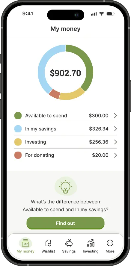
For young users, the experience centered on understanding and allocating money rather than simply tracking balances.
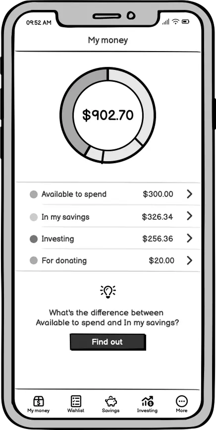
- Money buckets
A clear breakdown of money for spending, saving, and giving, helping users understand tradeoffs at a glance.
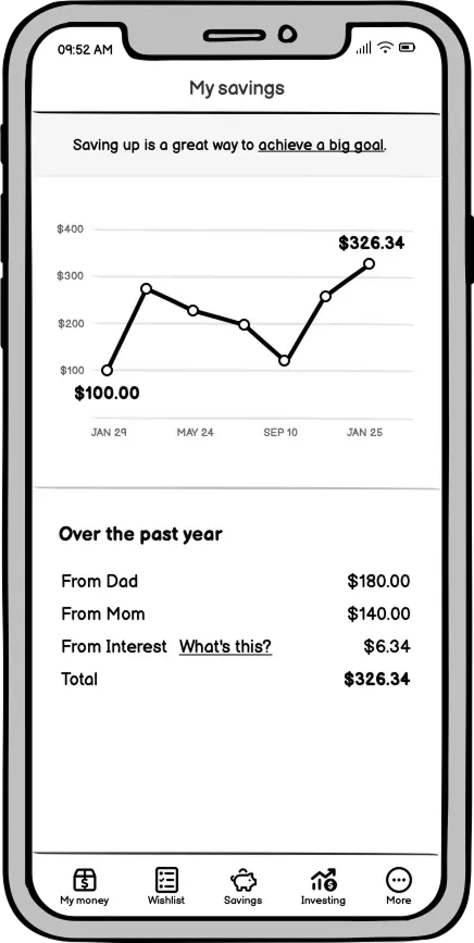
- Savings goals and wishlists
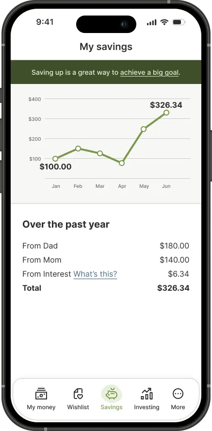
Goal-based saving tied to outcomes users cared about, reinforcing planning and delayed gratification.
- Giving and causes
The ability to allocate money toward charitable causes, reinforcing values-based decision making.
- Learning through context
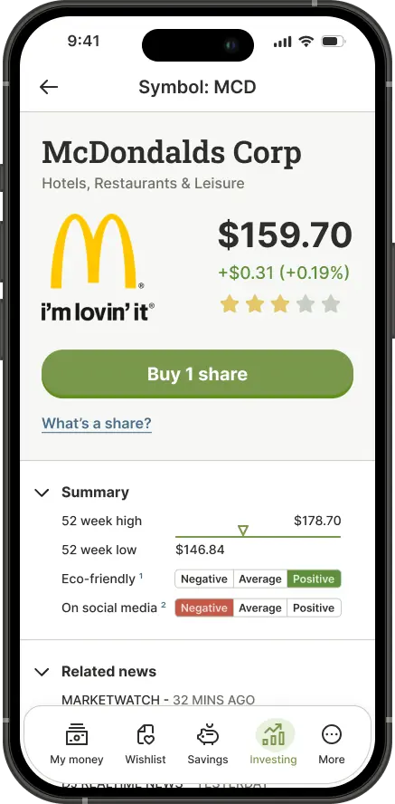
Educational content surfaced alongside actions, teaching concepts at the moment they were relevant.
The tone avoided talking down to users, treating financial literacy as something learned through participation rather than instruction.

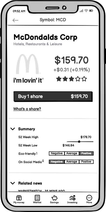

Experience for parents
For parents, the experience focused on oversight without micromanagement.
- Setting up allowances and recurring contributions
- Creating and assigning chores tied to earnings
- Reviewing and approving requests to spend or invest
- Viewing activity history and notifications over time
Approval flows were designed to be intentional but lightweight, allowing intervention without becoming a daily bottleneck.
Validation and testing
Usability testing with young people and parents validated navigation clarity, comprehension of financial concepts, comfort with approval workflows, and the perceived balance between autonomy and control.
Participants, particularly younger users, consistently understood where their money lived and how it was being used, reinforcing the importance of clarity over feature density.

Outcomes
Although the concept never progressed to market, it successfully demonstrated how financial education could be embedded into real-world actions and validated a dual-audience model balancing independence and oversight.
The work surfaced UX patterns that informed future thinking and provided a shared artifact for cross-functional conversations about long-term customer relationships.
Most importantly, it showed that financial literacy doesn’t require removing complexity, but designing it responsibly.



Reflection
This project reinforced the importance of designing for growth rather than current capability and explored how trust, education, and autonomy can coexist in youth-focused financial products.