On this page
I led the UX strategy and cross-functional delivery to replace an antiquated portfolio management and trading platform used by financial asset managers. The modernization effort reduced operational complexity, improved manager workflows, and eliminated $13M in recurring annual costs.
The story
A large financial services organization relied on an aging third-party portfolio management and trading platform to manage sleeve accounts for a group of internal asset managers.
Sleeve accounts allowed a single client account to be divided into virtual sub-accounts, enabling different investment strategies, asset classes, or models to be managed under one umbrella. The workflow was highly specialized, but the platform supporting it was not.
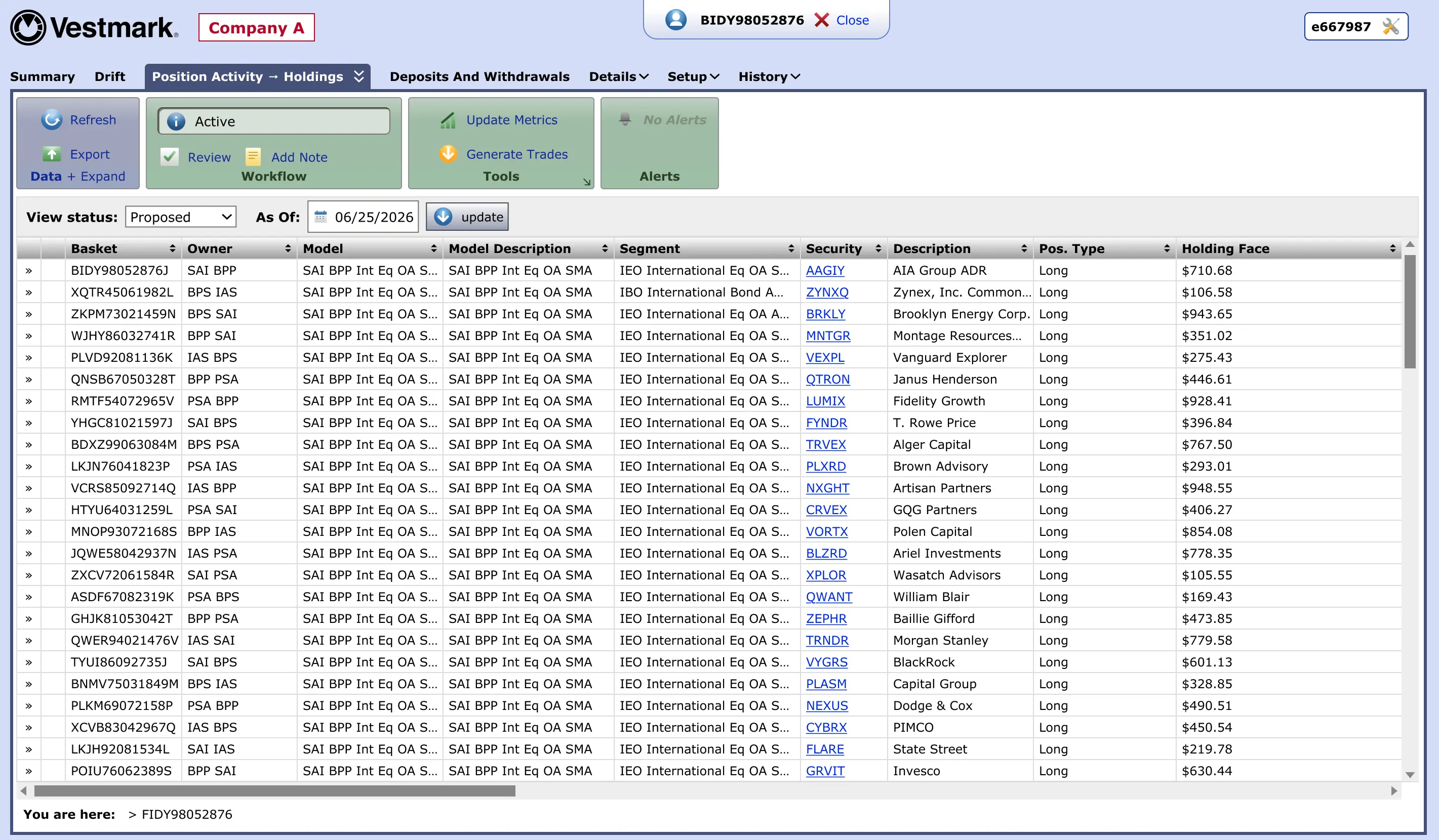
The legacy system was part of a much larger suite of financial tools, many of which were not used by the internal sleeve managers. As a result, the experience was overloaded with unnecessary features, confusing navigation, slow page loads, and workflows that were difficult to learn.
The organization was also paying approximately $13M annually to use and maintain the legacy vendor platform. The opportunity was to replace it with a focused internal experience that supported the actual needs of sleeve managers while eliminating a significant recurring cost.
The problem
The legacy platform was powerful but overly broad. It had been designed to support a wide range of portfolio management and trading capabilities, but the internal sleeve managers only needed a narrow subset of those features.
This created a convoluted experience where important workflows were buried among unused features. Navigation was difficult for new managers, page performance was slow, and the interface carried years of accumulated complexity that no longer matched how the team actually worked.
The training risk was especially important. Many of the existing sleeve managers were veteran users who were close to retirement. Replacing or onboarding new managers into the legacy experience would have been difficult because so much knowledge lived in people's heads rather than in clear, intuitive workflows.
- The organization was spending approximately $13M annually to use and maintain the legacy platform.
- The interface included many capabilities that were not used or needed by sleeve managers.
- Navigation was difficult because specialized workflows were buried inside a broad vendor suite.
- Long load times interrupted focused portfolio and trading work.
- The legacy front-end carried significant technical weight, including a CSS file over 500 KB.
- Training new managers would become increasingly difficult as experienced users approached retirement.
My role
I led the UX strategy and cross-functional delivery for the platform replacement effort.
- Defined the UX direction for the replacement platform.
- Mapped the sleeve manager workflow and identified core user needs.
- Separated essential capabilities from inherited platform complexity.
- Simplified trading and portfolio management workflows.
- Partnered with product, engineering, and business stakeholders.
- Helped align the modernization effort around user value, operational efficiency, and cost reduction.
My role was not simply to redesign the old system. It was to help determine what the new platform should be, what it could safely leave behind, and how it could support a specialized group of users more efficiently.
Discovery
Discovery focused on understanding how sleeve managers actually used the legacy platform. Although the vendor system contained a wide range of portfolio management, model management, reporting, and trading functionality, only a portion of it was relevant to the internal teams.
We worked to separate essential workflows from inherited complexity by identifying the tasks managers performed daily, the screens and data they relied on, the features they ignored, and the places where navigation slowed them down.
This helped reveal that the primary UX challenge was not feature parity. The goal was not to rebuild the legacy platform one screen at a time. The goal was to preserve the workflows that mattered while removing the complexity that made the old system difficult to use.
Experience strategy
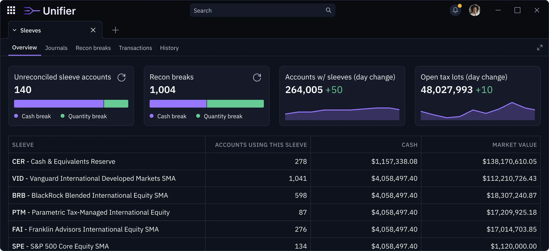
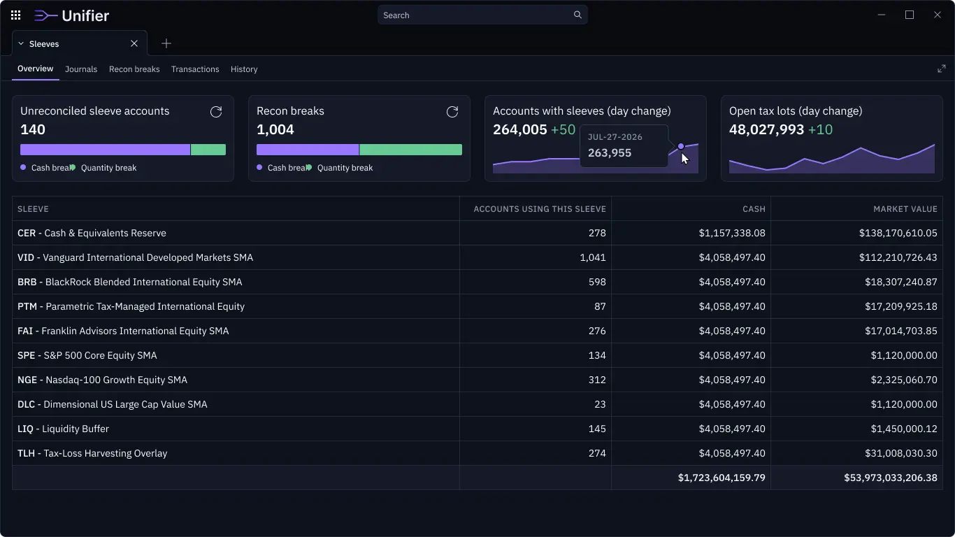
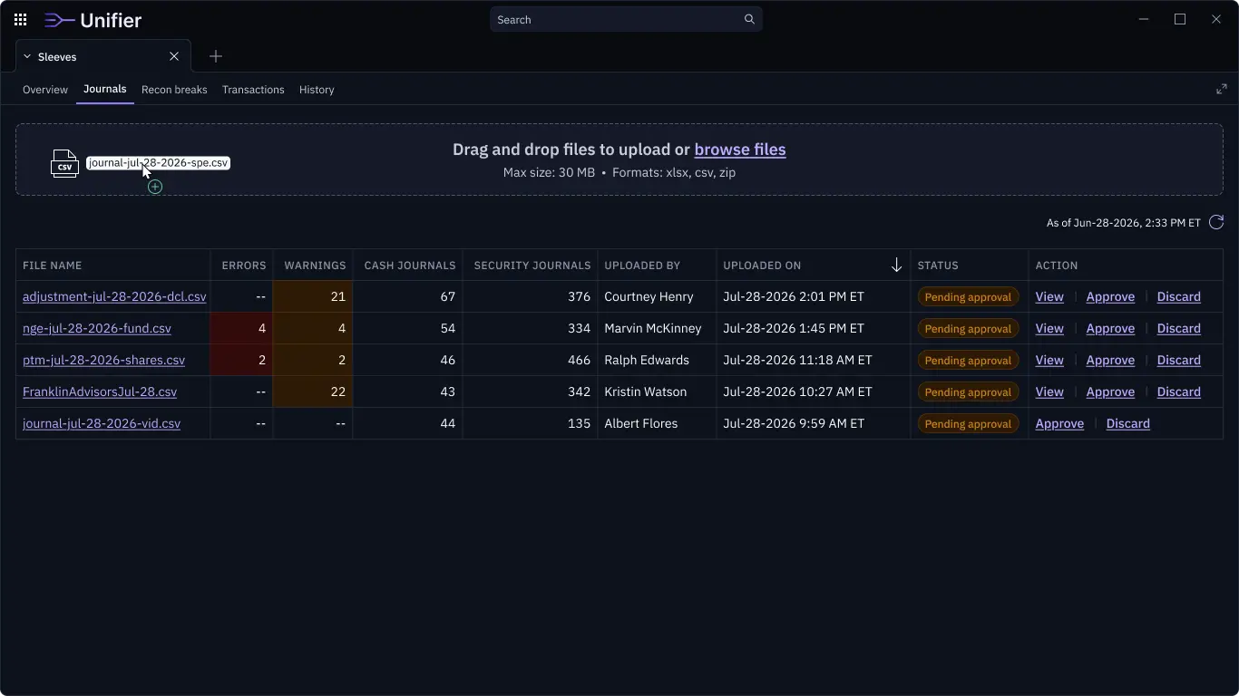
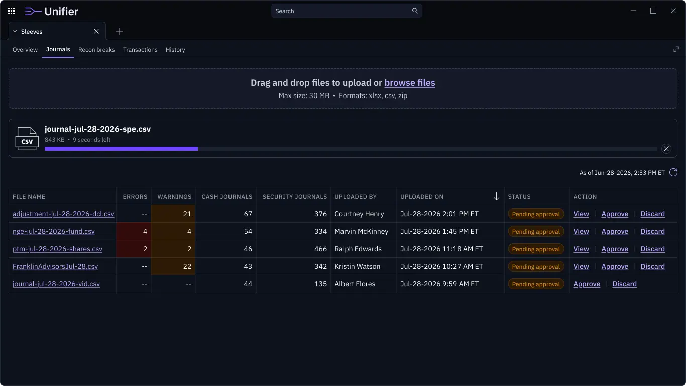
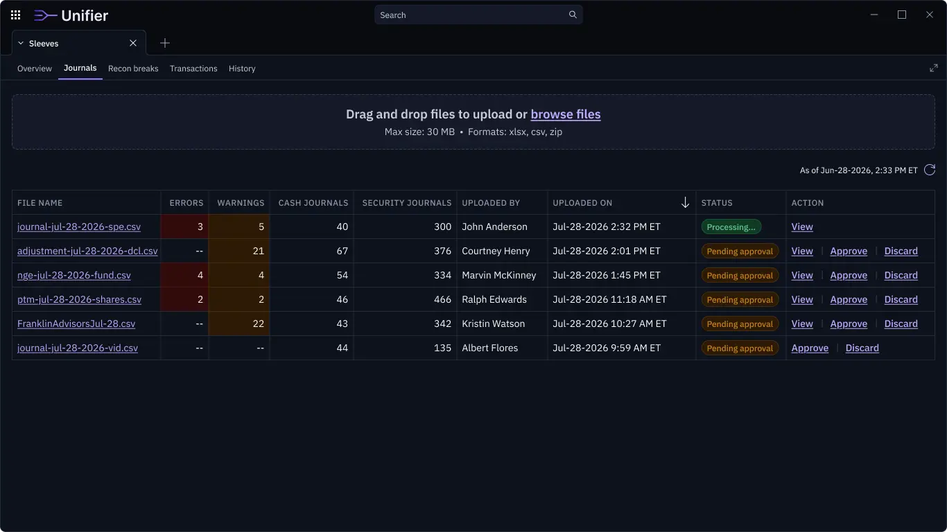
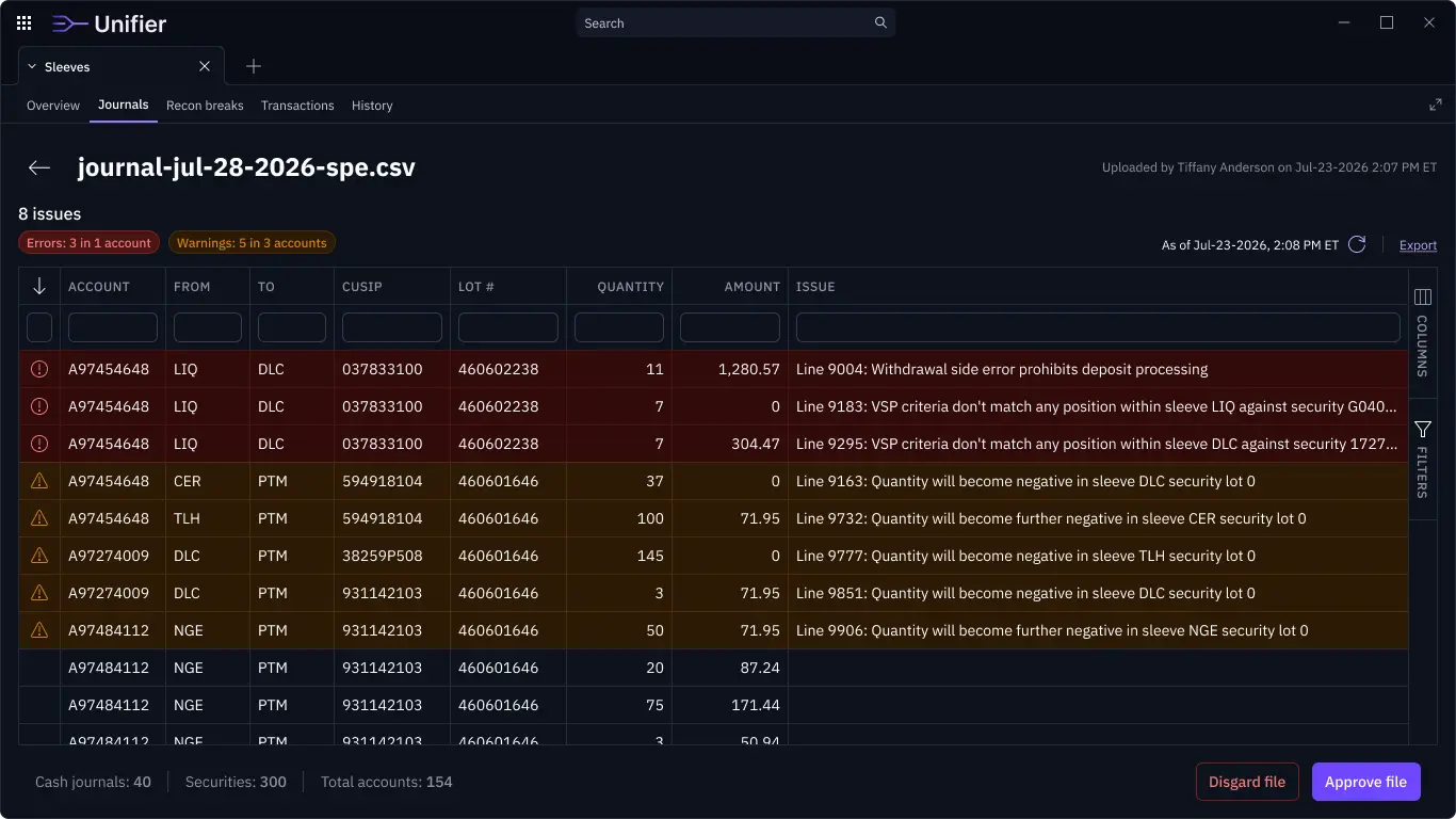
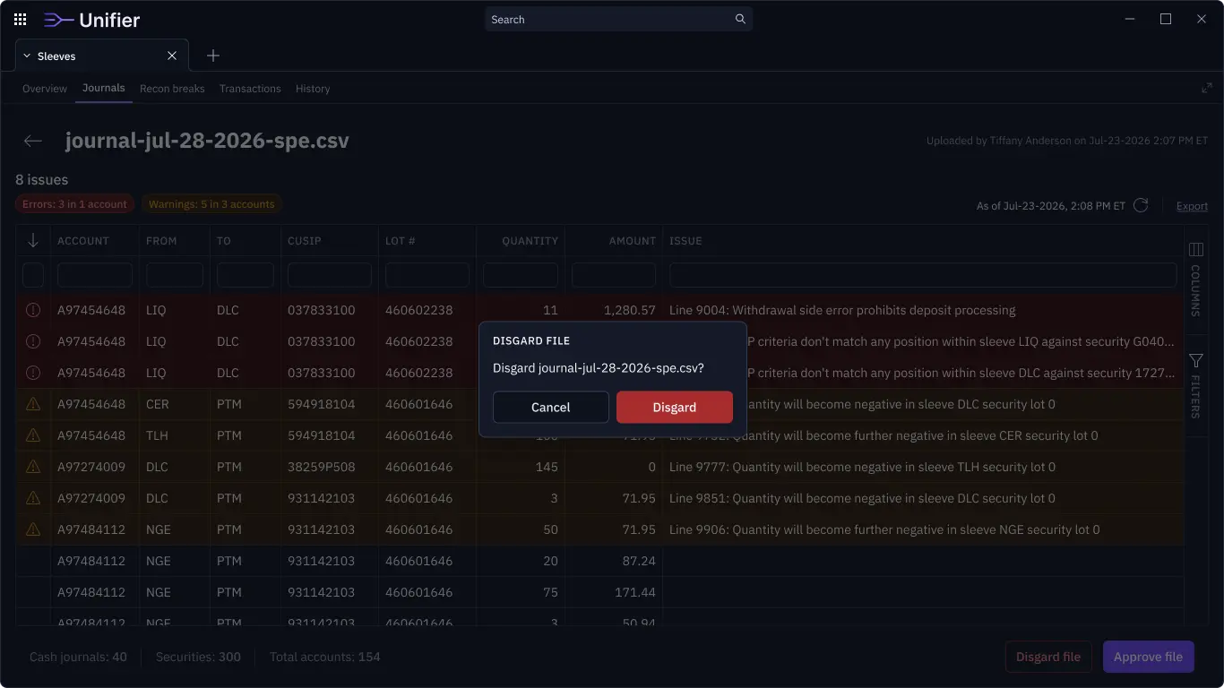
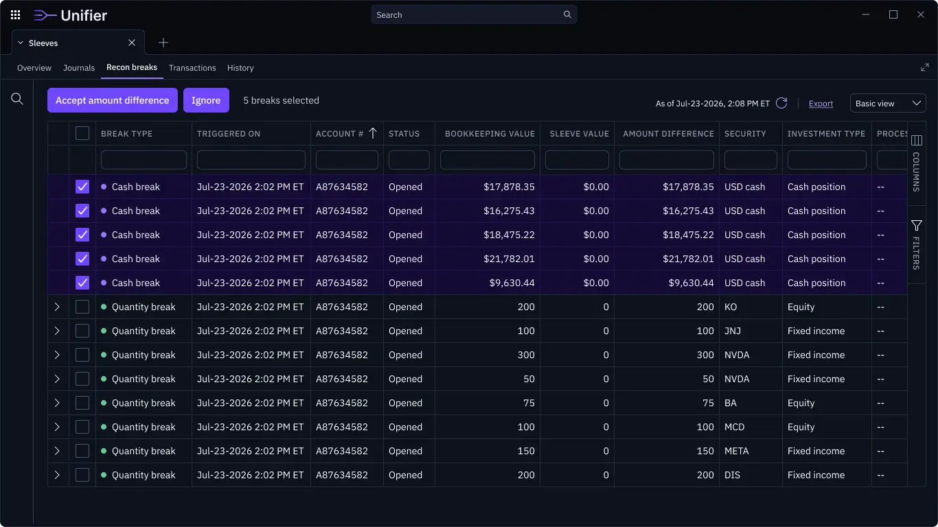
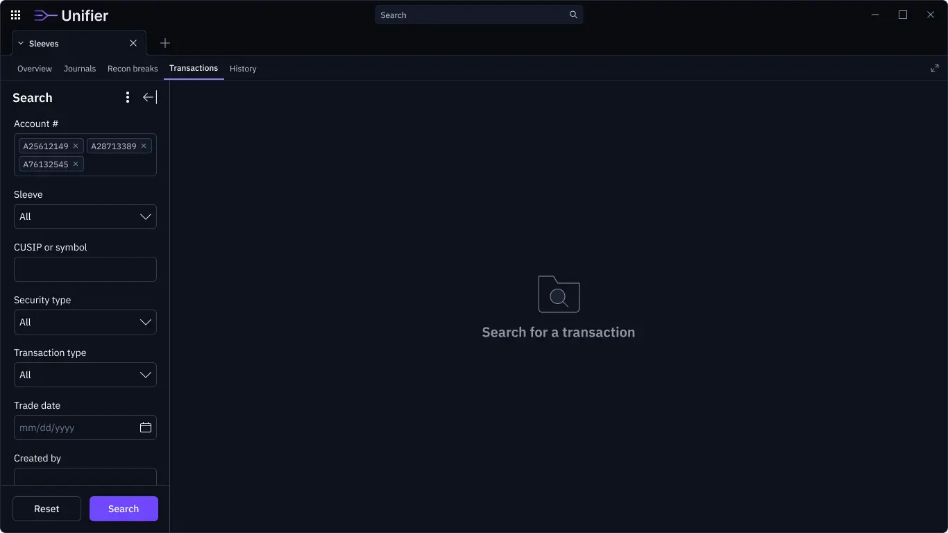
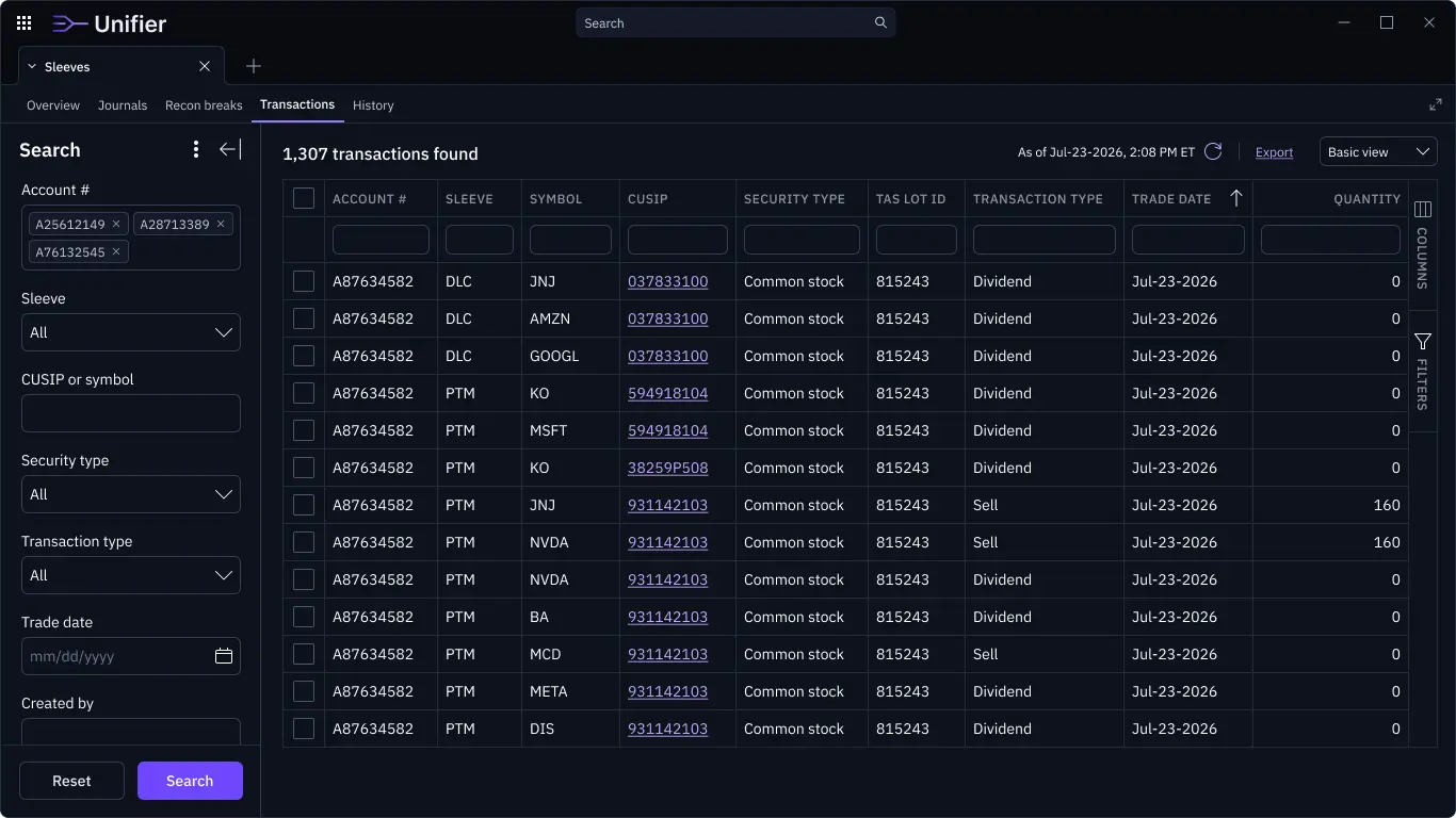
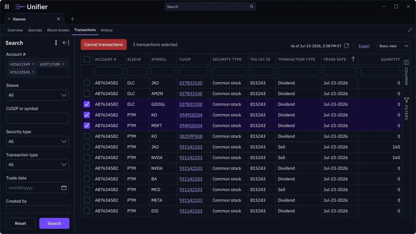
The replacement platform centered on the workflows sleeve managers performed most often. Instead of exposing users to a broad vendor suite, the new experience focused on portfolio context, sleeve-level visibility, trading actions, and the information managers needed to make confident decisions.
Sleeve account management required users to understand how a broader account was divided across investment strategies or models. In the legacy system, this information was often buried behind complex navigation and surrounded by unrelated functionality.
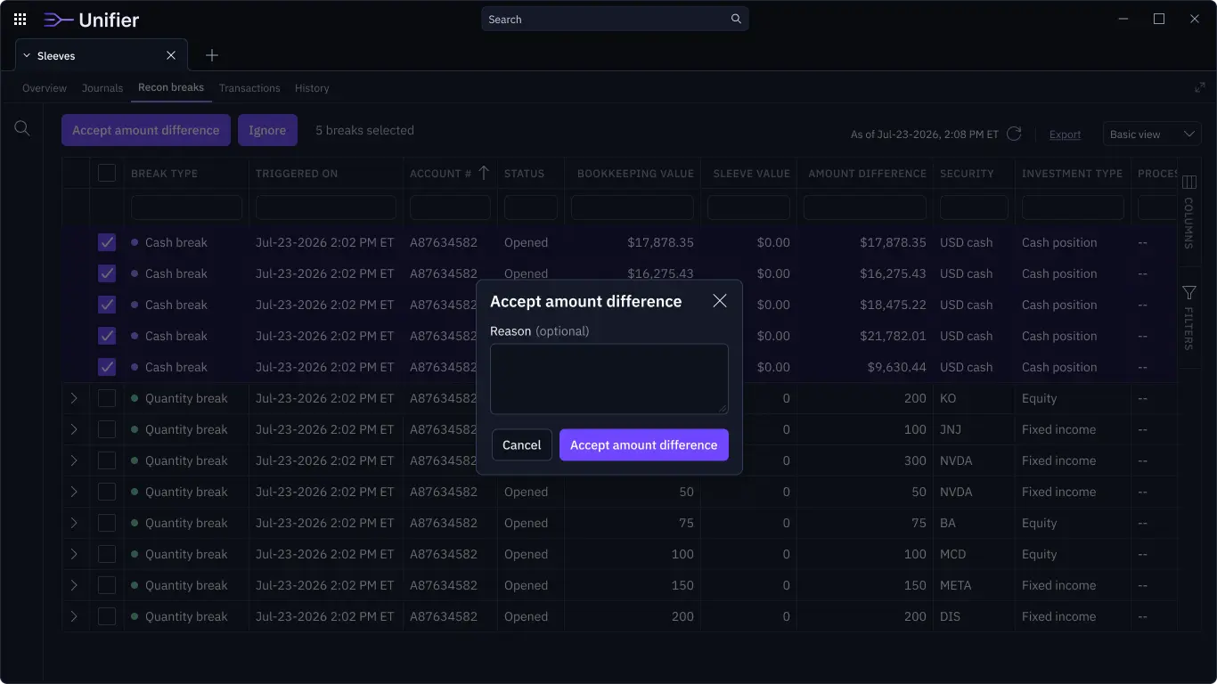
The new experience made sleeve context more visible and easier to act on. Managers could more quickly understand which sleeve or strategy they were working with, how assets were allocated, what positions and balances were relevant, which accounts required attention, and what trades or adjustments needed to happen next.
By focusing the interface around sleeve-specific workflows, the platform reduced the amount of searching, filtering, and interpretation required to complete routine work.
Cross-functional delivery
Replacing the vendor platform required close partnership across product, engineering, business, and operations stakeholders.
The work required balancing business value, workflow continuity, and experience simplification. The platform needed to eliminate a $13M annual vendor and maintenance cost while still allowing sleeve managers to perform specialized trading and portfolio management tasks without disruption.
A major part of the design effort was helping stakeholders distinguish between what needed to be preserved, what needed to be redesigned, and what could be removed entirely.
Outcomes
The modernization effort replaced an expensive legacy vendor platform with a more focused internal experience.
The work eliminated approximately $13M in recurring annual costs, reduced dependency on a third-party trading and portfolio management platform, and simplified sleeve account workflows for internal managers.
It also removed unnecessary functionality from the day-to-day experience, improved navigation, reduced interface complexity, supported knowledge transfer as experienced sleeve managers approached retirement, and created a clearer foundation for future internal trading and portfolio capabilities.
The result was not just a redesigned interface. It was a more focused platform strategy that aligned user needs, operational efficiency, and business value.
Reflection
This project reinforced that modernization is not the same as rebuilding.
The legacy platform had many capabilities, but many of them were not relevant to the users we were designing for. The most important design work was deciding what not to carry forward.
By focusing on the workflows sleeve managers actually needed, we were able to simplify a complex experience, reduce training risk, and support a major business outcome.
For enterprise platforms, UX impact is often measured not only in usability improvements, but in operational cost, workflow clarity, and the ability to retire systems that no longer serve the organization well.